Information only disclaimer. The information and commentary in this email are provided for general information purposes only. We recommend the recipients seek financial advice about their circumstances from their adviser before making any financial or investment decision or taking any action.
That headline might get a few replies to my inbox. To add fuel to the fire, I need to be clear that I’m not an economist.
However, with the unprecedented volatility we’re seeing with both inflation and the resultant interest rates hikes designed to kill it, understanding the mechanics of inflation is critically important to establishing an informed (and not emotional) view on where interest rates might go.
In this article, I want to talk about how inflation is measured and the indicators that are used. Plus, I want to discuss some of the flaws in the current approach which may lead into some of the unintended impacts that are going to be with us for years to come.
Why is this important?
It seems that both current inflation levels and the central bank response to it is like a large rubber band at present. The further it gets stretched away from the middle, the bigger the impact when it lets go. We’ve seen the impact of the far too loose monetary policy to date.
Are we set to see the pendulum swing too far again, but this time the other way?
Ok, first lets school up on inflation.
Inflation, broadly occurs when demand for goods and services in the economy outpaces supply.
Without going into detail, we all know that too much of it is a bad thing. It’s colloquially called “the thief in your pocket”.
Get it right and it means households and business can have normal stable activity Get it wrong and it can lead to all sorts of market distortions and erratic behaviour for both business and consumers.
Ultimately, a very high inflation rate puts a dent in the trust that people have in money – if people think it’s not going to be worth a similar amount in the future it starts to lose its “trust”.
Noone wants that to happen.
How is it calculated?
Inflation is calculated by examining a “basket” of goods and services and how they change in price over time. This might be food, petrol, rent or consumer electronics. This data is collected by Stats NZ and presented as a CPI index. At the moment, its running at 7.2% well above the mandated band of the RBNZ of 1-3%.
Issue one: CPI is measured over a 90-day period (quarterly) and looks backwards.
We’ve just been informed by Stats NZ in late January, that CPI for the quarter ending December 2022 was 7.2%. That’s all of the spending change in October, November and December last year.
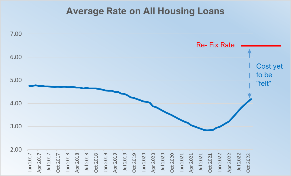
In October last year households were paying an average of only 4.07% on their home lending (due to still having fixed rates in place – see more on this below). Household savings were still semi-high and Adrian Orr hadn’t delivered his November monetary statement reprimanding public spending and talking of significant further increases in rates.
In other words, people hadn’t changed much at this point.
In other countries such as the US, CPI is measured monthly - we think adopting this system would be a very good start.
Issue two: CPI doesn’t record change of volume of spend - only a change in price.
What’s really interesting about the calculation methodology is that it measures the changes in price of particular goods or services, but it doesn’t measure the change in volume of how many or how much we’re purchasing them for. They are weighted, but that weighting only changes every few years.
For example, if food prices (which make up ~19% of the index) go up for the year by 10% but we all collectively spend 10% less because we can’t afford as much (meaning purchasing volume goes down), this registers as a 10% increase in inflation (for that category) even though we may have spent the entire amount.
Now economic theory solves for this – i.e if we are all start buying less of something that costs more, that, “in theory”, with all else held equal, might lead to a build-up of stock of that item which would then mean that prices would go down to bring supply and demand back into equilibrium *
But that takes time to work through- again, “a lag”.
(* this statement is not entirely correct when it comes to food at present – as inventory itself won’t build if the actual supply has reduced – which is currently the case with food due to Covid issues and geo-political supply line disruption)
Issue three - fixed rates - average interest rates on home loans are still low (but rising fast).
About 50% of all fixed rate loans will come off this year.
At the moment (as of Nov 2022), the average rate being paid given a mix of historical fixed rates, is still only 4.07%. We estimate it is probably about 4.50% by the end of January – but that is still a mile away from the current short term re-fix rate of 6.50%. In short, the pain and impact on spending in the economy is still coming and set to intensify.
Given the high use of fixed rates by New Zealand homeowners, albeit quite short in length (1-3 years), you could effectively put up the OCR to 10% and it wouldn’t make much difference to how much a homeowner is paying on interest right now.
This comment is an extreme example, as it would definitely have the impact of scaring the population into spending less due to fear of the future – but the point is that it takes time for the increase in OCR to work its way into actual spending habits. You must be patient to see its effects as it flows through the fixed curve.
However, the impact is happening much quicker in farming and in business where loans are typically more likely to be floating commercial type products and they see the rises everywhere, the 30 or 90 day bill goes up. They are feeling it sooner.

