Information only disclaimer. The information and commentary in this email are provided for general information purposes only. We recommend the recipients seek financial advice about their circumstances from their adviser before making any financial or investment decision or taking any action.
We’ve been through (and arguably are still going through) a period of pretty ugly inflation in New Zealand. Inflation has impacted on all sectors of our economy. but farming felt it more keenly being exposed to some big increases in wages, fertiliser and fuel.
So, given the changes in inflation, what does a good milk payout now look like?
With many farmers looking to make investment decisions and also considering hedging policies, we thought it might be useful to put out a few graphs showing the difference between inflation and non inflation adjusted payout data over the last 20 years to assist.
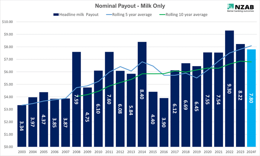
The first graph below is “nominal” milk payout (Fonterra Milk, excl. dividend) since 2003.
Nominal means exactly that - it’s the actual payout in that year, not adjusted for inflation:

(flick me an email if you'd like a copy of a larger version of these graphs):
As well as the milk payout in any one year, we’ve added two lines:
- Rolling 5 year average in blue – this, including this year’s current forecast of $7.80, is currently at $8.08.
- Rolling 10-year average – in green – this is currently $6.80.
Both lines are trending up which is obviously good.
And this year's $7.80 on a “nominal basis” is our 4th best payout of all time
But given we have ongoing inflation, what does it look like if we now historically adjust for inflation all of the past 20 years of payout?
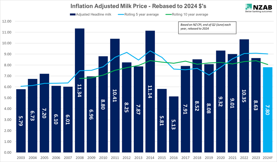
Take a look at the next graph, which now expresses each payout year in “2024 dollars”, according to CPI inflation. This is where it gets super interesting.

When we line our current year of $7.80 up against that data, this “4th best payout” in the last 20 years” is now readjusted to 14th place.
So what is now “average”?
The inflation adjusted rolling 5 year average is that blue line – this average, including this year’s current forecast of $7.80, is $9.02. When considered on 10 year rolling basis average – in green – this is $8.06 in “2024 dollars”
Another way of putting it is, if we nudge up to $8 this year – it will be exactly the same as the average for last 10 years, when adjusted for inflation.
However, versus the last 5 years, it’s a little underwhelming – over $1 less than the 5-year average of $9.02
If we took the inflation adjusted average over the entire 20 years (all the data), this would be $8.23.
If you decided to ignore the extreme market dynamics caused by increased world supply that occurred in 2015/2016, the 5 year average has been consistently around $9 (in 2024 dollar terms) since 2011.
However, if you thought that this volatility was going to be an ongoing feature of the market, then something around $8.25 would be your “average”.
Either way, we start to get a relatively tight range of $8-$9 that we can start using as “average” for investment and hedging planning.
On this basis alone, the current year of $7.80 would seem to be an underside outlier. Where we started at $6.75 certainly was.
Furthermore, if an average of $8.50 was put into every dairy farmers budget this year, most would be continuing to enjoy a very sound (without being spectacular) rate of return.
And importantly, given the inflation adjusted average line is level (and in the case of the last 5 years, increasing), this means that Dairy Payout is at least keeping track with inflation and arguably moving ahead.
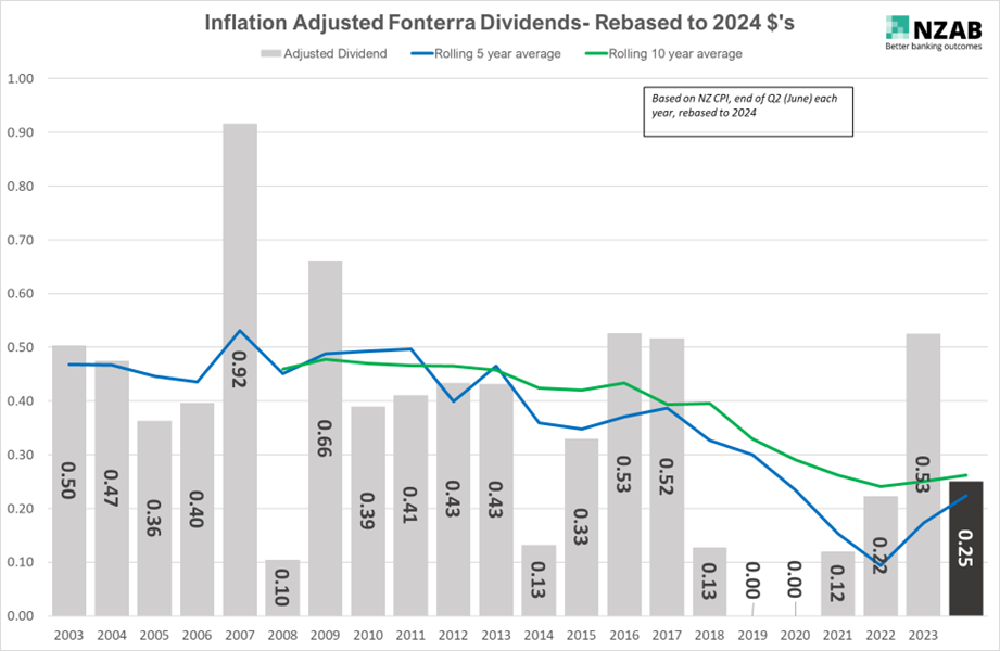
For your own interest, the final graph below of inflation adjusted Fonterra dividend alone shows some interesting rolling averages as well.

Putting the inflation adjusted dividend together with milk payout, a fully shared Fonterra farmer has received;
- Over last 5 years: $9.25
- Over last 10 years: $8.32
- Over the last 20 years: $8.57
How should you use this data and what are the limitations?
Overall CPI does not equal farmer CPI for their costs. A more perfect way to examine whether Dairy Farm returns are tracking with or ahead of inflation is to also take into account Farm CPI inflation as well. We will explore this in the future.
However, using some adjustment for inflation is better than not at all, particularly when we have been through some significant step changes in inflation in the last 2-3 years.
Using “nominal” data alone has risks. This inflation adjusted data might help farmers form part of their decision making for what “average” might look like when assessing their investment strategy or putting in place hedging policy.
At the same time, it’s worth noting that a farmer needs to assess a multitude of factors* beyond just payout when forming their own policies for risk management and investment decisions.
(*These other factors include the likes of debt leverage levels, regional climatic/ production volatility, facility headroom and credit availability, balance sheet strength and liquidity, income diversity, shareholder risk appetite and operational leverage).
Who is NZAB?
.jpg?width=540&height=360&name=NZABStaffGroups55%20(1).jpg)
Farming’s very complex and you can’t be an expert in everything. That’s why the best farmers gather a specialist team around them. Our specialty is better banking outcomes for our clients.
There’s no one better to work alongside you and your bank. With a deep understanding of your operation and our considerable banking expertise, we can give you the confidence and control to do what you do best.
We’ve been operating for over five years now and we’re right across New Zealand, For an introductory no cost chat, pick up the phone and talk directly to one of our specialists on 0800 NZAB 12.
Or if you prefer, Visit us at our website or email us directly on info@nzab.co.nz

